
MORROW
ENHANCING EVERY ELEMENT FOR THE LIFESPAN OF A BRAND.
Brief
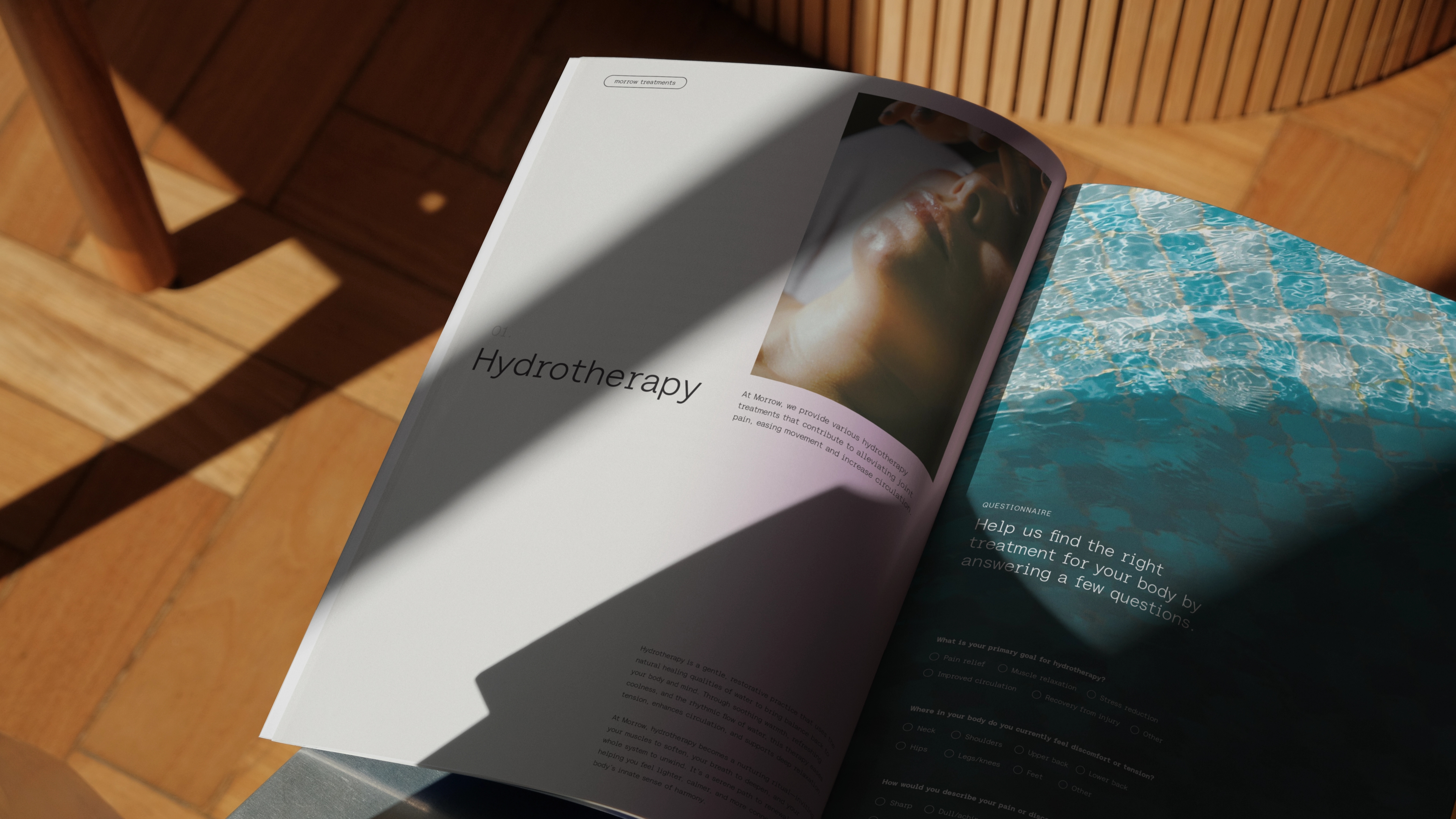
Morrow provide world-class facilities, combining extensive health & wellbeing expertise with sophisticated data analysis to craft a physical and digital, AI-powered ecosystem. They came to us pre-launch for support creating every element of their identity. One that reflects the highly personalised experience they offer, while balancing lifespan wellness with a community mindset.
deliverables
- Brand Strategy
- Visual identity
- Verbal identity
- Art direction
- Graphic system
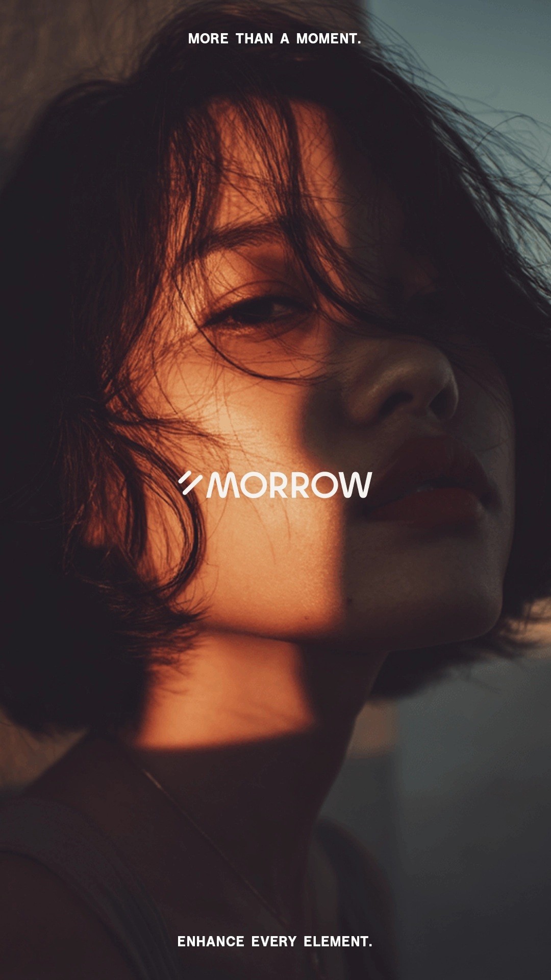
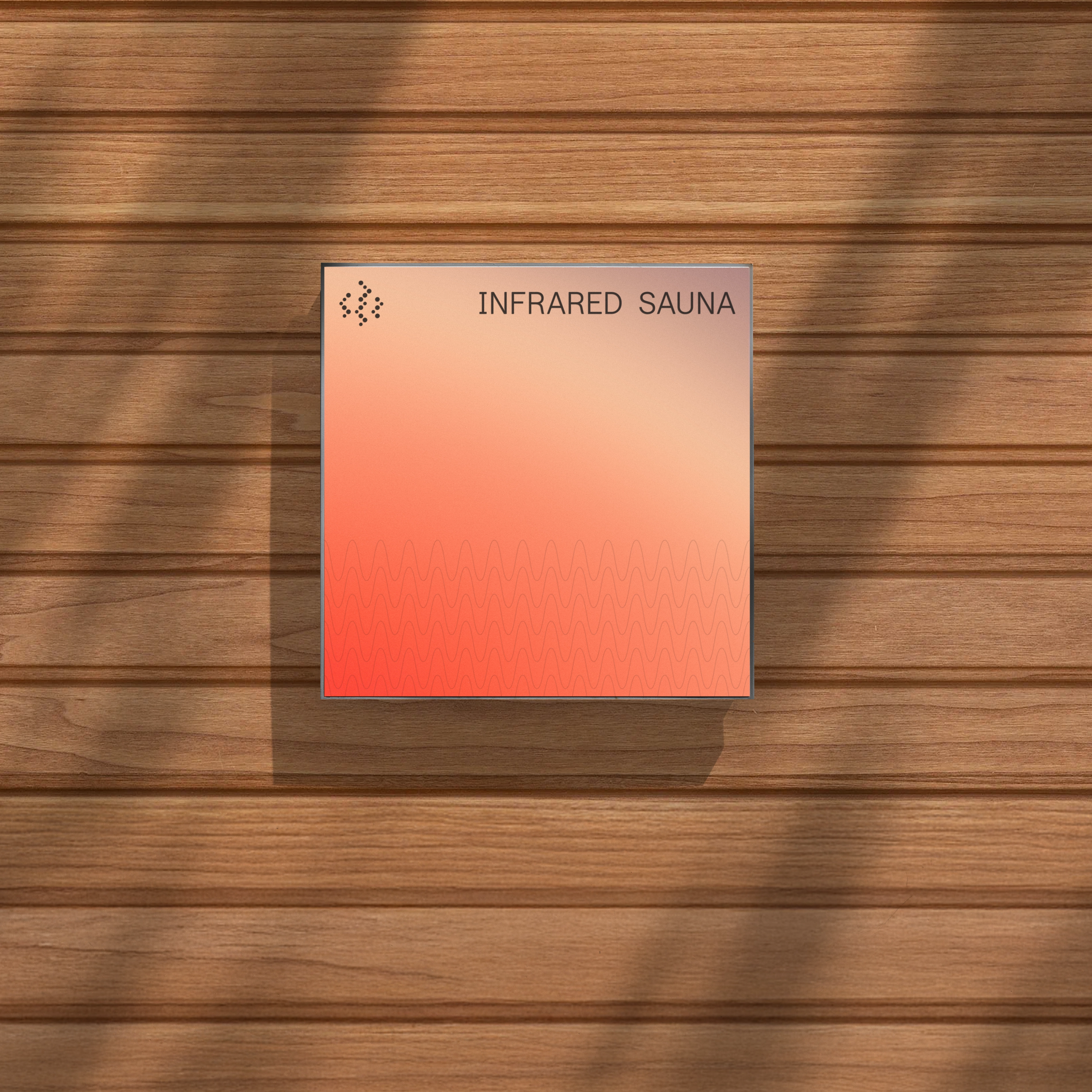
FROM DAWN FROST TO SUNSET FIRE
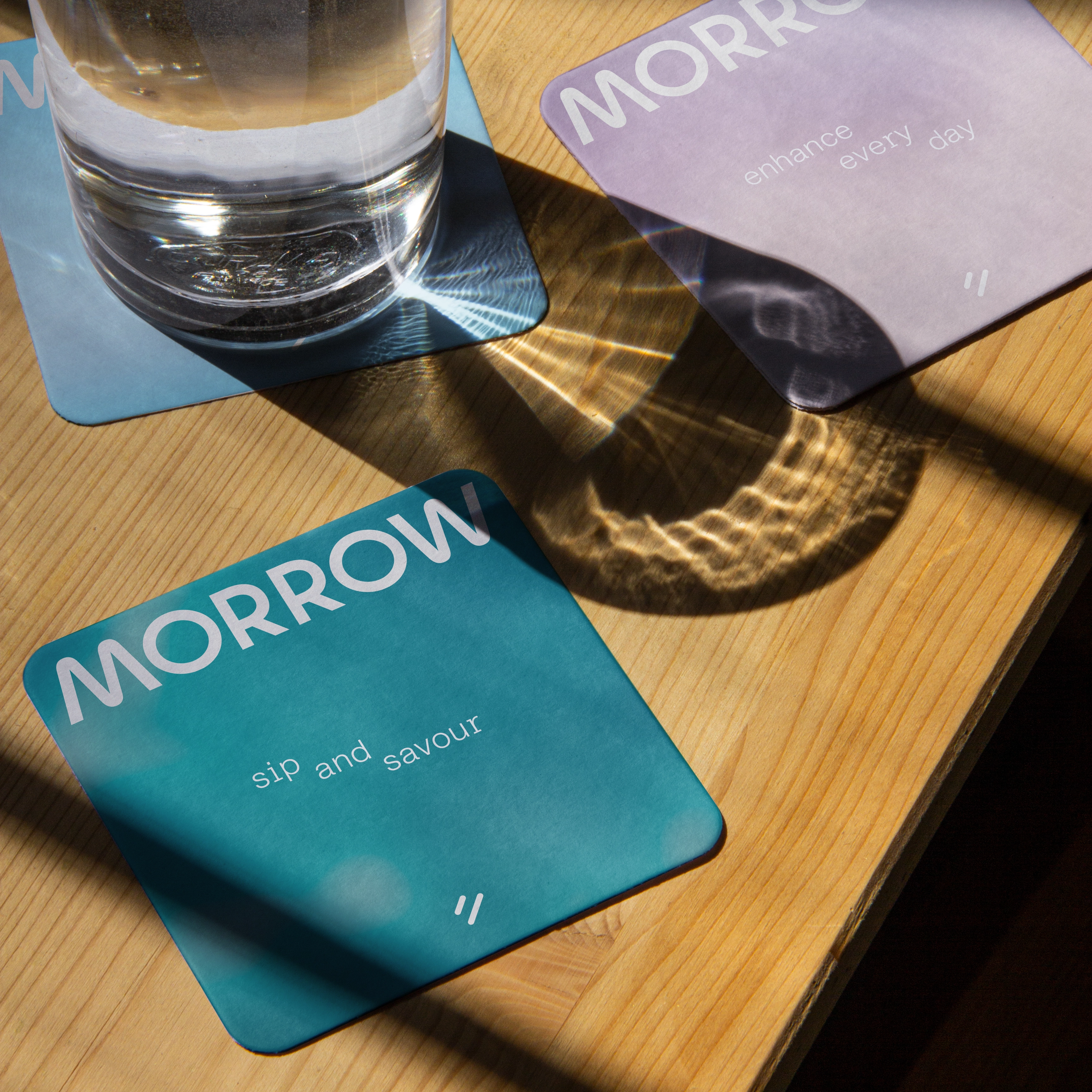
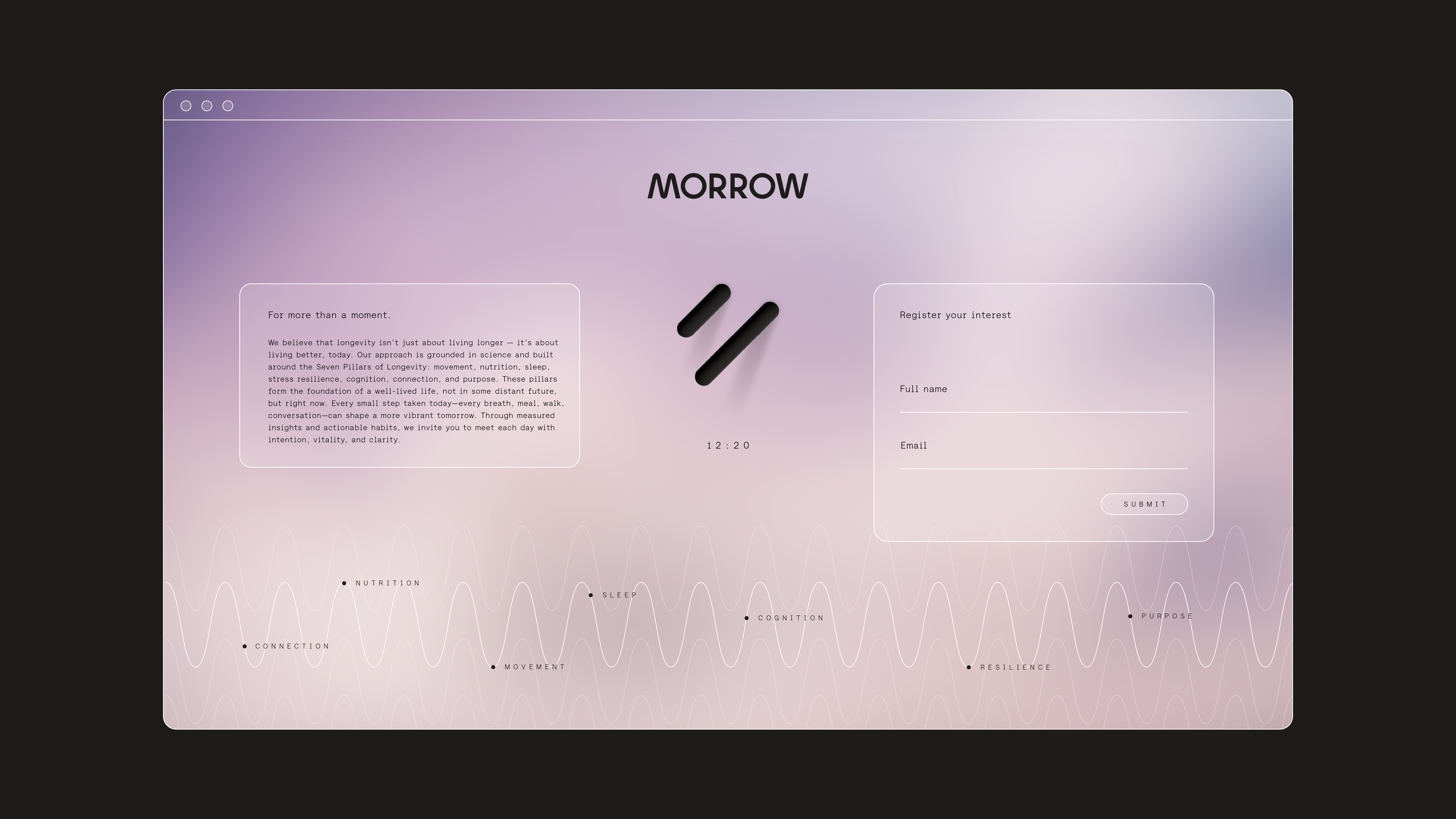
Inspired by the moments in the day where we find self reflection, our visual identity interpreted the natural light of dawn, the morning, golden hour, sunsets, twilight and dusk into gradients. These times of day created gently shifting, light tracking gradients, that we solidified into a versatile colour palette.
AS ABOVE, SO BELOW
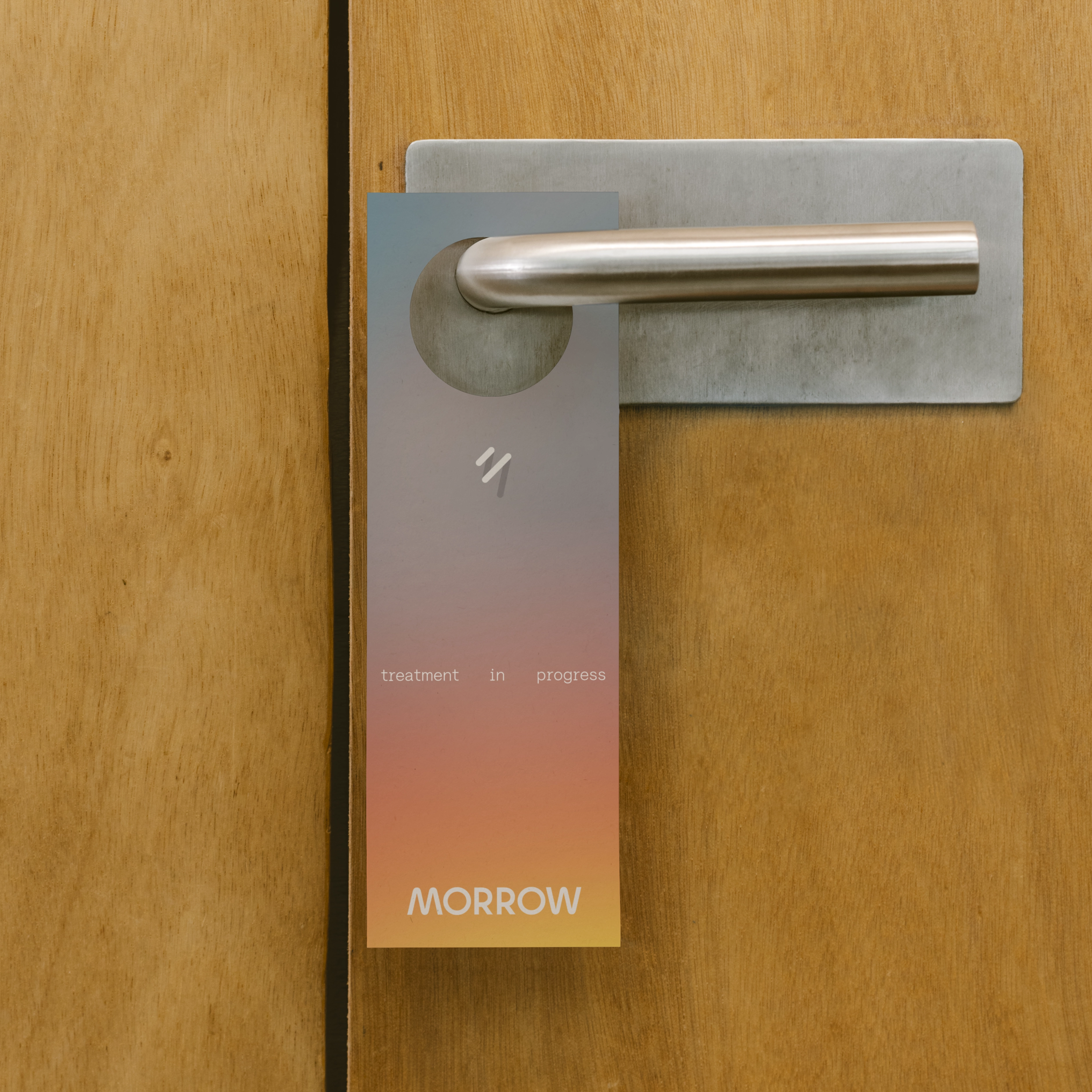
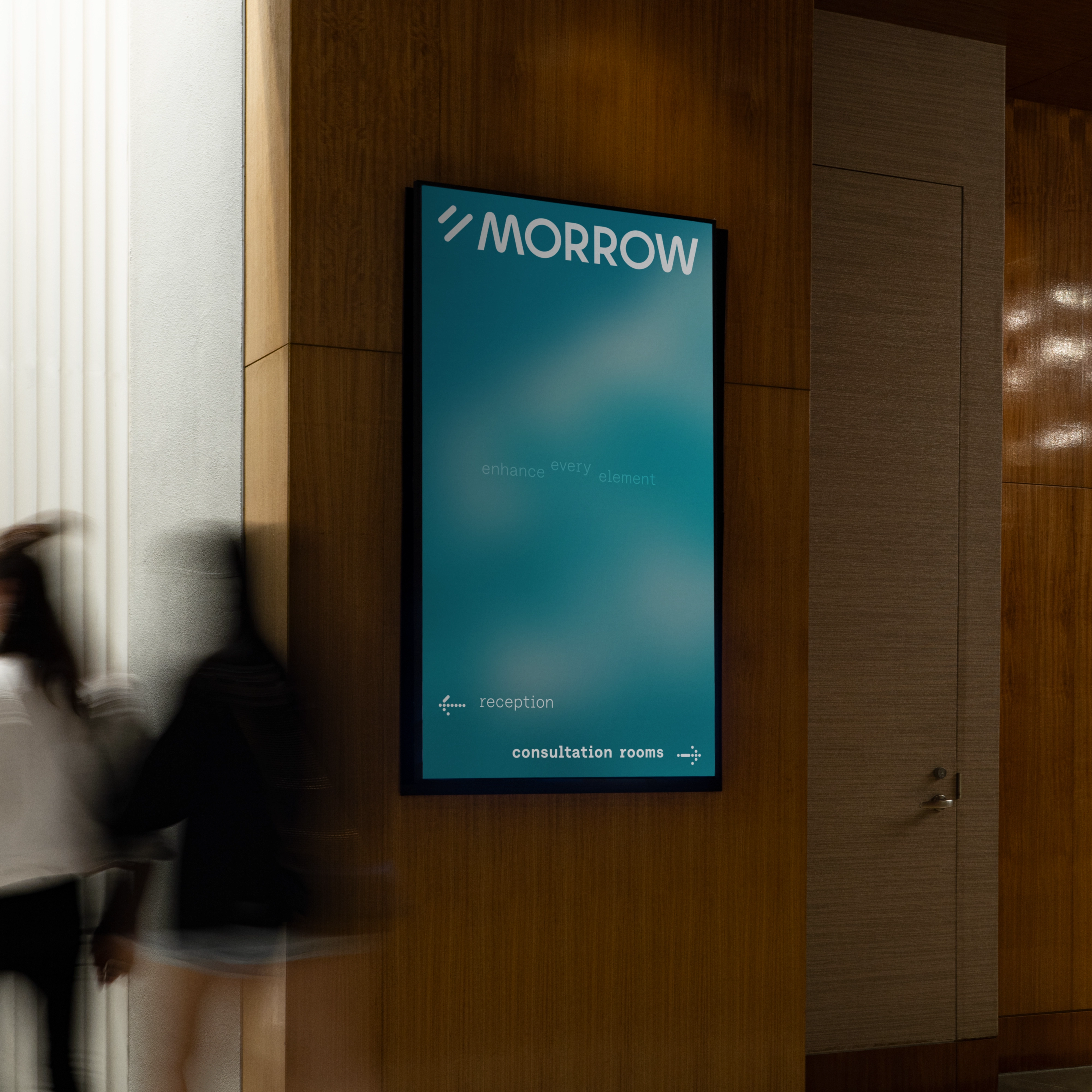
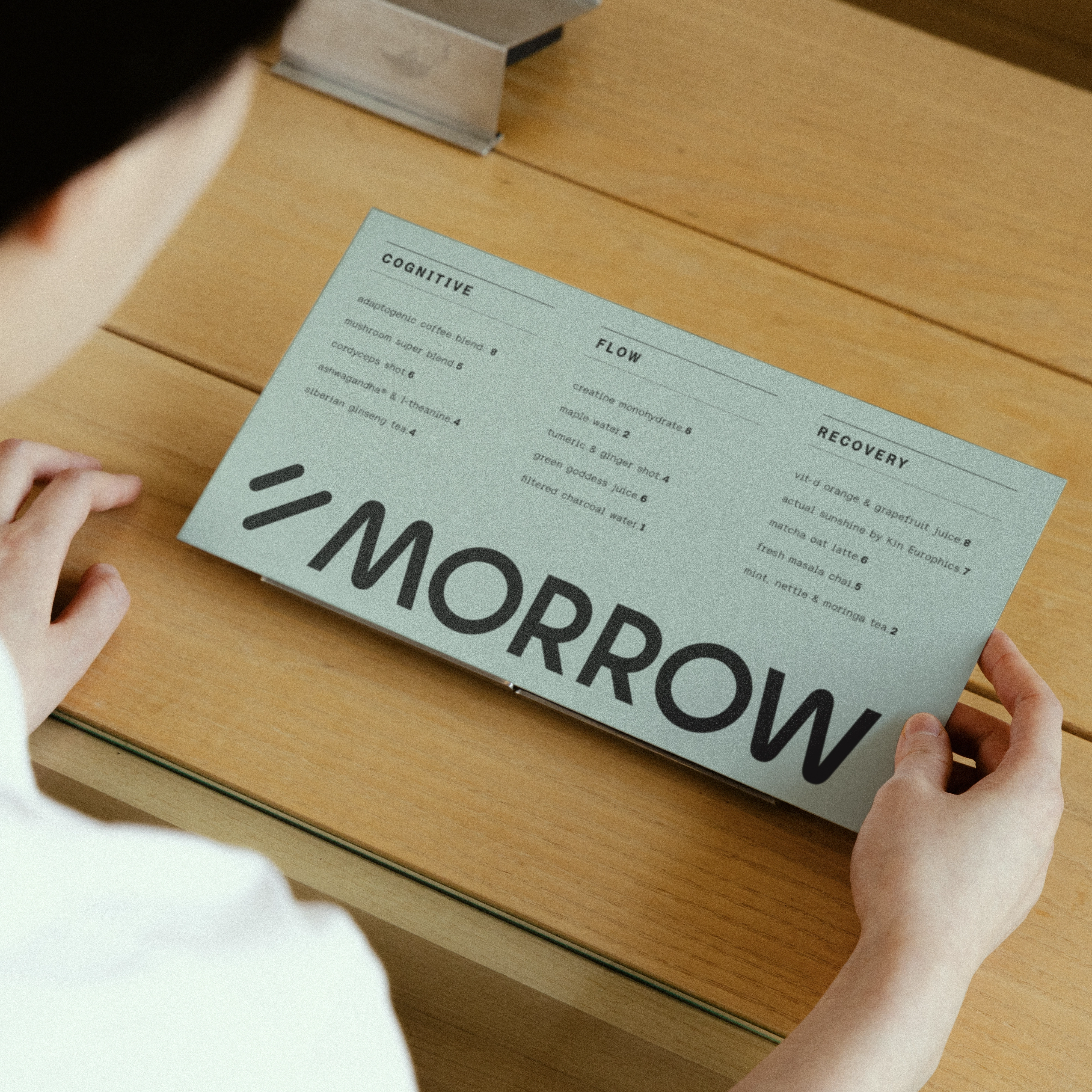
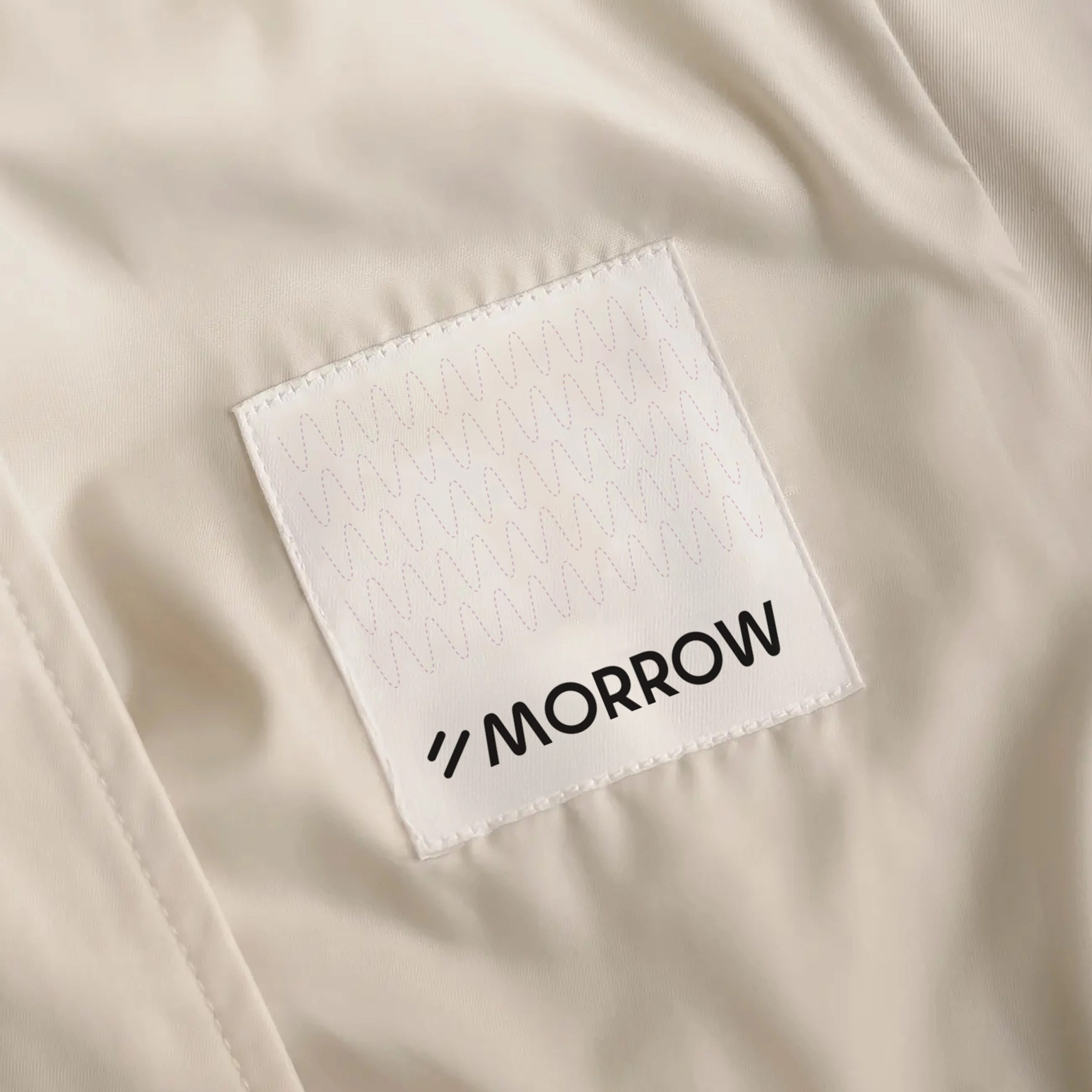
Our logomark represents the promise of what tomorrow might bring. The two diagonal bars, part-sundial, part letterforms of an M and W as light is cast on them, references the logotype. When unlit, the two bars reference the Mandarin character ‘èr’ (二), meaning ‘two,’ creating an interlingual play on words inspired by the brand’s launch location. When lit, they mirror the shadow of time passing in the rotational ambigram in the wordmark (a typographic effect where a word is stylised to be symmetrical and is legible forwards and backwards).
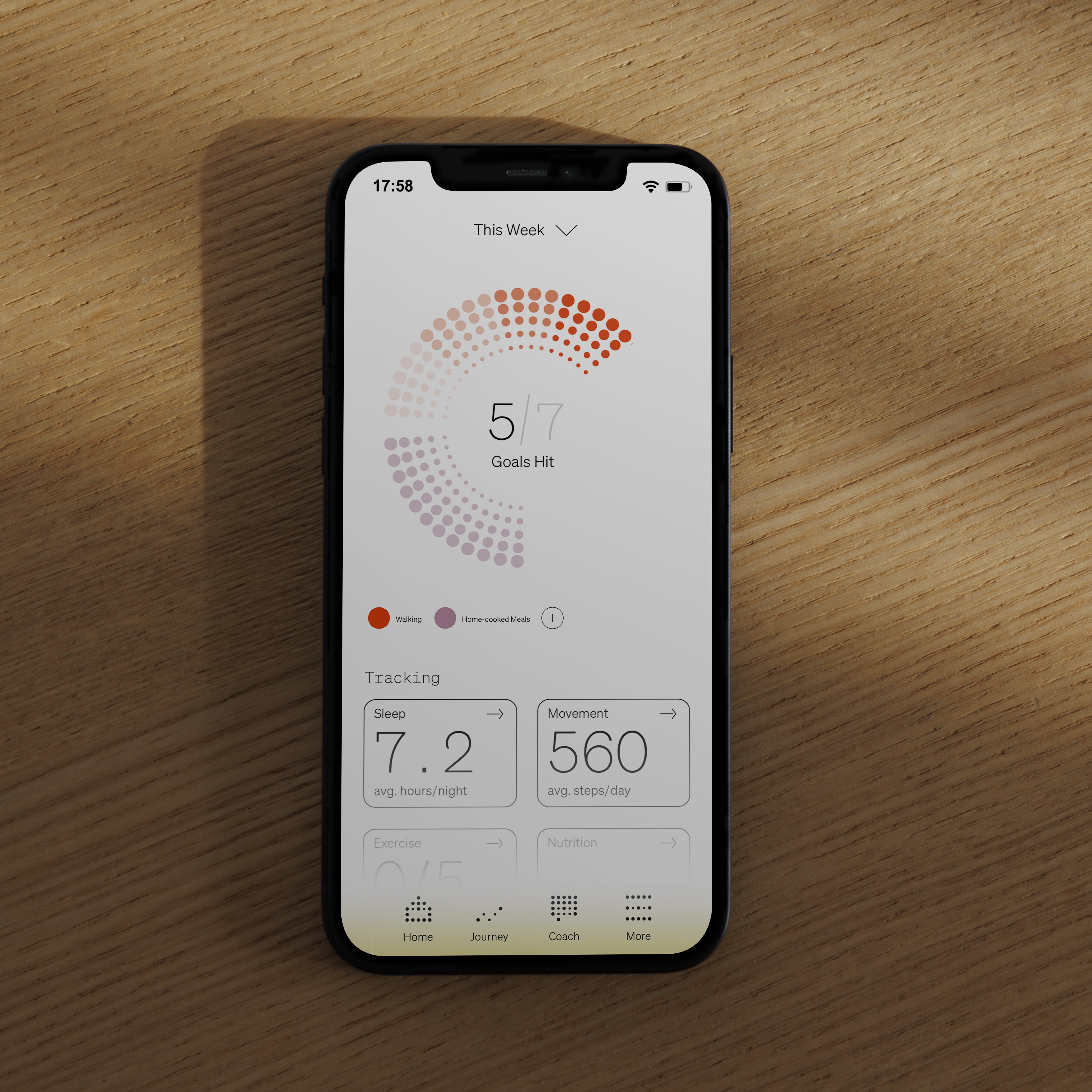
TRACKING MOMENTUM
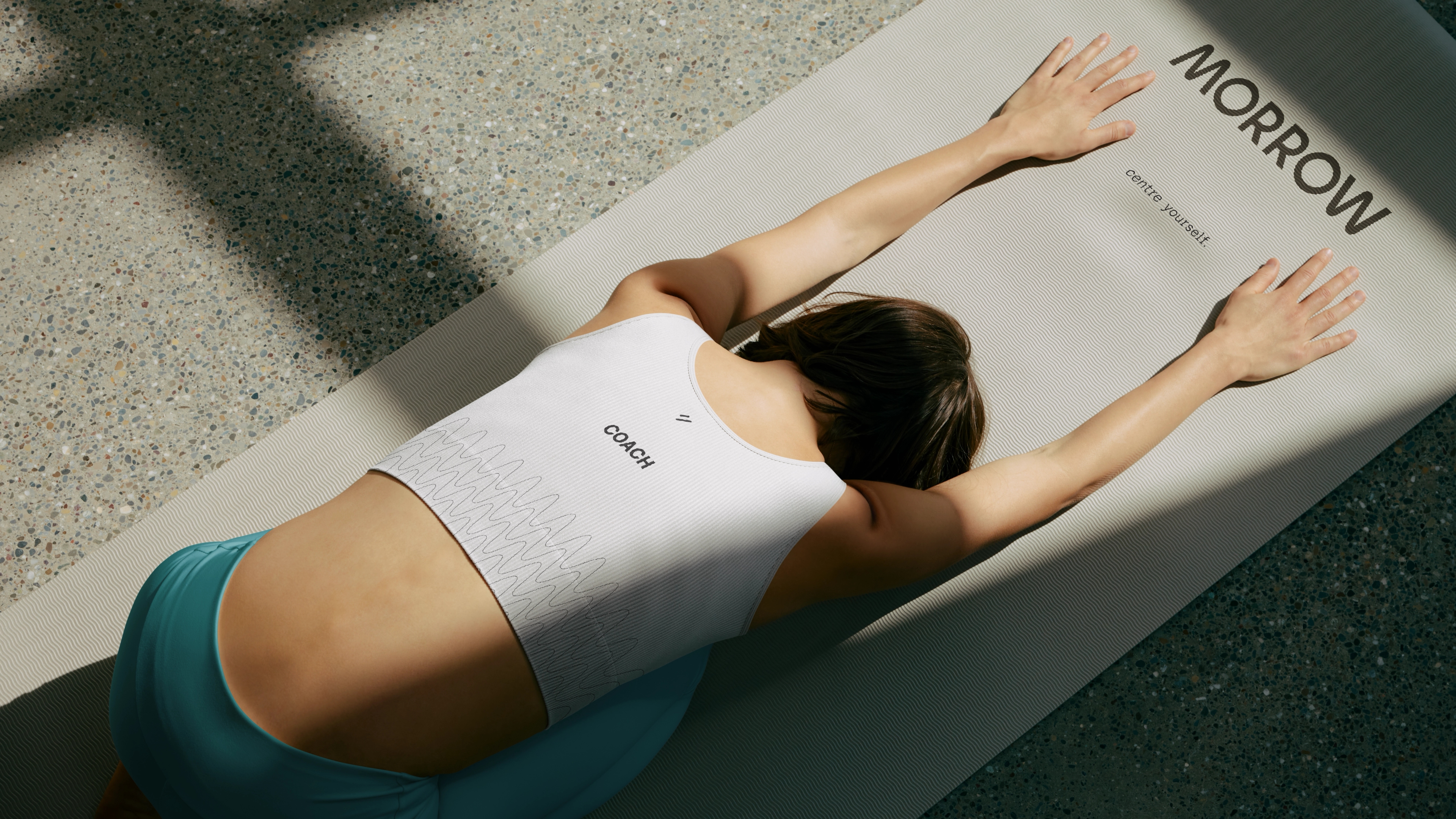
The logo grid also informs the icon suite, each built from the data points our health and bodily systems constantly output, that Morrow then tracks and draws insight from. Another brand visual element, the ECG line, further explores mirroring the letterforms in the word ‘morrow’ while reinforcing the momentum, pacing and data that make up the digital identity of the brand.
A COURAGEOUS COMMUNITY
Through in-depth strategy work incorporating the client’s research and our own, we created a verbal identity that is able to meet the needs of healthspan customers while flexing to their shifting mindsets, meeting them where they are in their health journey. Each stage of the cycle comes with its own challenges, whether the audience is feeling curious and cautious or energized and prepared.
Our tone of voice needed to be clear and easily translatable to different languages, while balancing determination (to change the healthcare landscape) with support (to create optimism, trust and a community feeling for our customers).